Smith Memorial Playground
Website Redesign
OVERVIEW
Redesigning a Philadelphia-based non-profit's website to improve usability, accessibility, and user engagement.
Located in Philadelphia's East Fairmount Park, Smith Memorial Playground and Playhouse is a unique indoor and outdoor playspace for children and is free for all. Opened in 1899, their mission is to provide and promote opportunities for unstructured free play for children.
Looking for a complete website redesign, I conducted research to determine areas for improvement that could address users' pain points and provide a more enjoyable user experience.
PROJECT TYPE
Personal project
TIMELINE
3 Weeks
TARGET AUDIENCE
Parents + Caregivers
ROLE
UX Designer
RESPONSIBILITIES
I was responsible for the entire design process from research and strategy to conception, creation, and product design.
TOOLS
Figma
Miro
InDesign
RESEARCH
User Interviews
I began by interviewing 10 parents and caretakers – some of whom have visited Smith Playground before and some of whom have not. The interviews focused on what they liked and disliked about the current website, as well as what their needs and desires are when searching for a playspace for their child.
KEY FINDINGS
UNCLEAR ON OFFERINGS
The users who were unfamiliar with Smith and had never visited complained that there were few photos on the website that showed what the actual playspace looked like and what type of play equipment was available. They also reported that the few photos that are on the website are closely cropped, making it difficult to understand what's in the photo.
DIFFICULT TO NAVIGATE
Many users reported difficulty navigating the site and finding important information like hours of operation and location. Additionally, users disliked having to navigate to a page in order to see the sub-menu since the main navigation bar lacks drop-down menus.
ACCESSIBILITY ISSUES
Two parents of children with special needs complained that there was no information on whether or not the playground offered accessible equipment and that they would have to call to find out. Some users also had difficulty reading some of the text as they found it too small.
RESEARCH
Heuristic Evaluation
I also reviewed Smith's website and performed a heuristic evaluation where I highlighted areas that I suspected might be causing issues for users. I generated a report which identified inconsistent visuals, repetitive information, and general navigation issues.
Aesthetic and Minimalist Design, Consistency
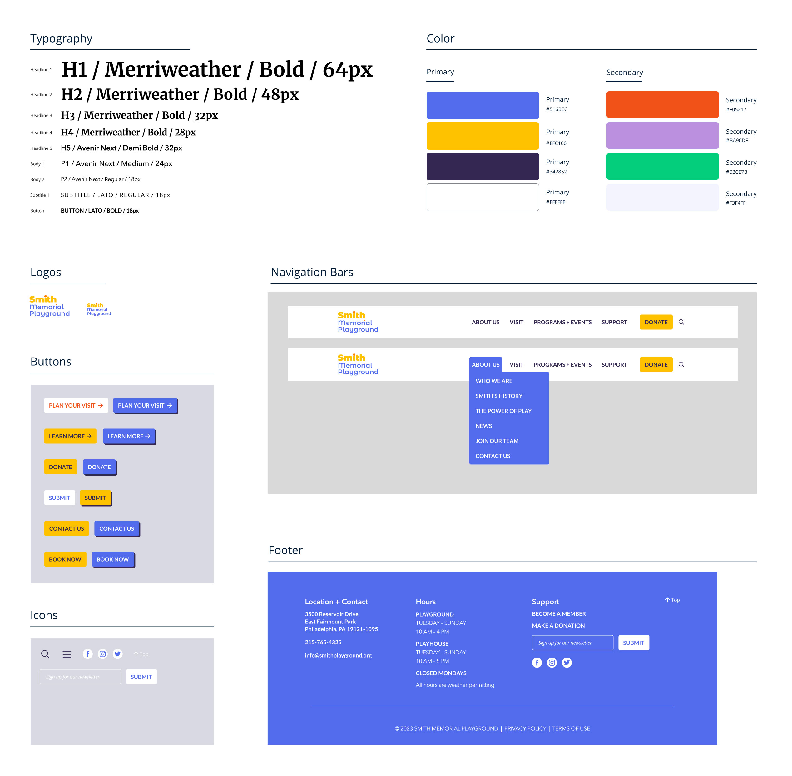
With 5 call-to-action buttons on one page, users can become overwhelmed and visually fatigued as each button competes for their attention. The buttons also vary in size and have inconsistent fonts.
Proposed Solution: Have one main "Donate" CTA button in the upper right-hand corner of the navigation bar. All other CTA buttons should be placed strategically and thoughtfully so as not to distract the user. Maintain consistency among all buttons in terms of size, shape, font, and color.
Recognition Rather Than Recall
Finding Smith’s location proved to be a challenge as it is buried in a Contact Information sub-menu under About Us. Since this is the only location where this information can be found, users have to remember where to go to find it. This creates unnecessary cognitive load since the information is not visible or easily retrievable. Additionally, the site lacks a search bar making it challenging for users to search for what they’re looking for.
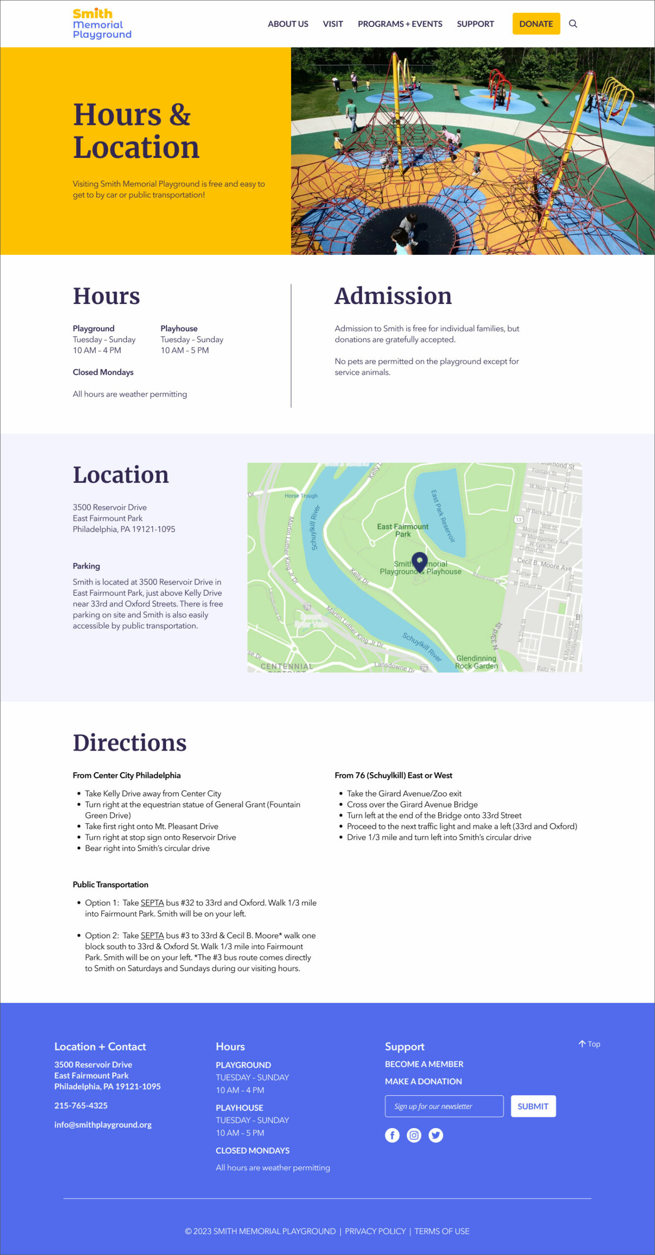
Proposed Solution: Add Smith’s location and hours of operation to the footer so it is always easily accessible, as well as to an hours and location page and contact page. Add a search bar to the navigation bar.
Accessibility
There were a number of contrast and legibility issues found on the site. The text links on the page below fail WCAG AA and AAA minimum contrast ratio guidelines. Additionally, the text sizes are also too small – 12 px for the body and 9 px for the visiting hours information. It is generally recommended that website body text be a minimum of 16 px.
Proposed Solution: Make all text a minimum of 16 px and create a color palate that meets WCAG AA/AAA minimum contrast guidelines.
RESEARCH
Competitive Audit
To get a sense of which features Smith's website might be lacking and conducted a competitive audit of other similar organizations. Since Smith is a rather unique organization with few direct competitors, I focused on parks and children's museums.
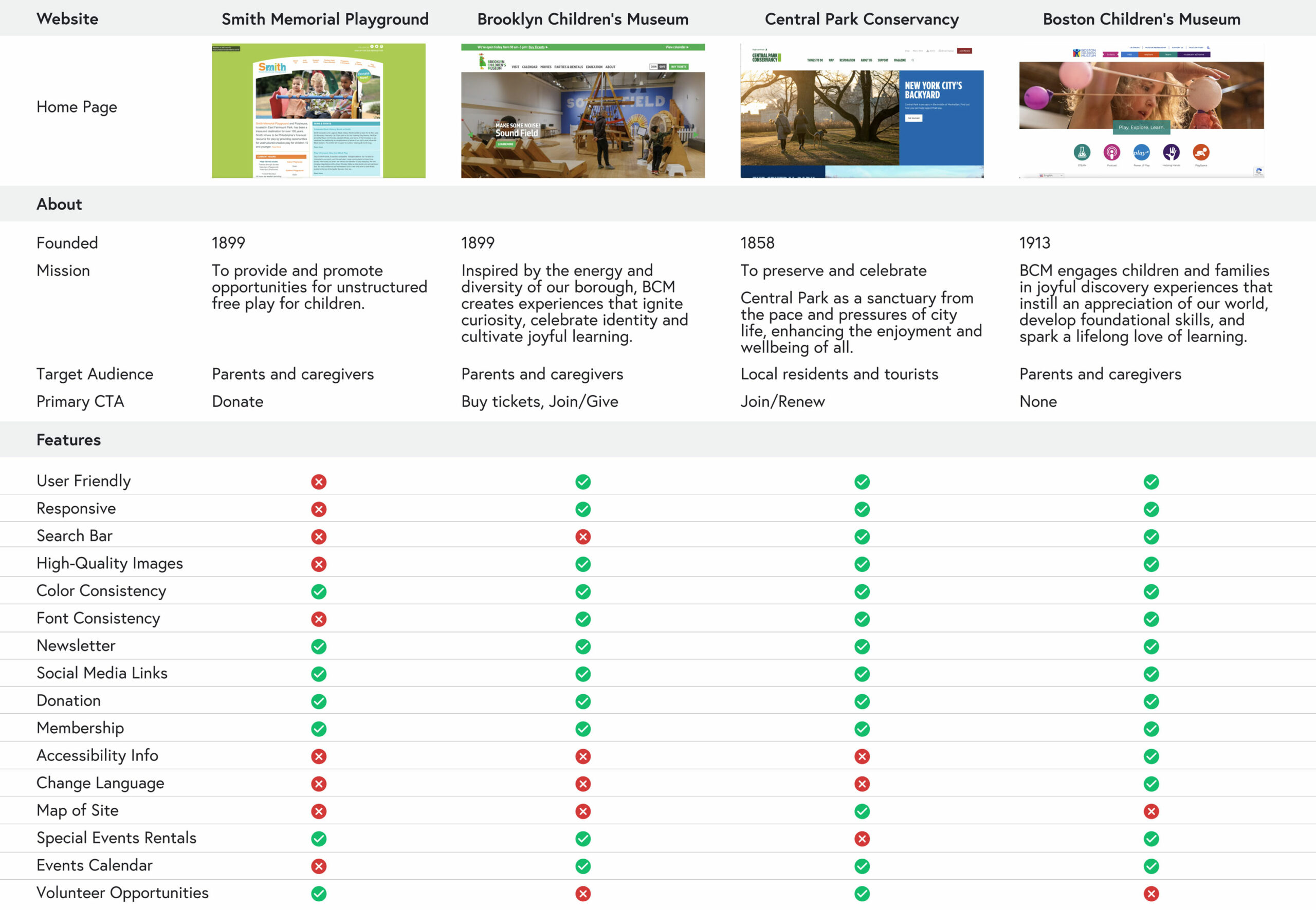
OPPORTUNITIES
HI-QUALITY IMAGES ARE KEY
High-quality images of what's on offer are crucial for businesses and organizations as users do not have time to read lengthy descriptions and may have difficulty interpreting text. Provide users with plenty of clearly-shot, visually enticing photos so they will have a clear understanding of what Smith has to offer and why they should visit.
CLEAR NAVIGATION IS A MUST
When users have difficulty navigating a site they often get frustrated and give up when they can't find what they need. Simplify Smith's information architecture and create a streamlined navigation bar with drop-down menus so users can quickly and easily find what they're looking for. Also, provide a search bar for those who prefer to search.
ACCESSIBILITY
Many of the children's museums' websites provided information on accessibility and it is important that Smith does as well so parents with children of special needs will feel comfortable visiting with their child. Additionally, Smith's new website should be designed to comply with WCAG guidelines so it is user-friendly for those of all abilities.
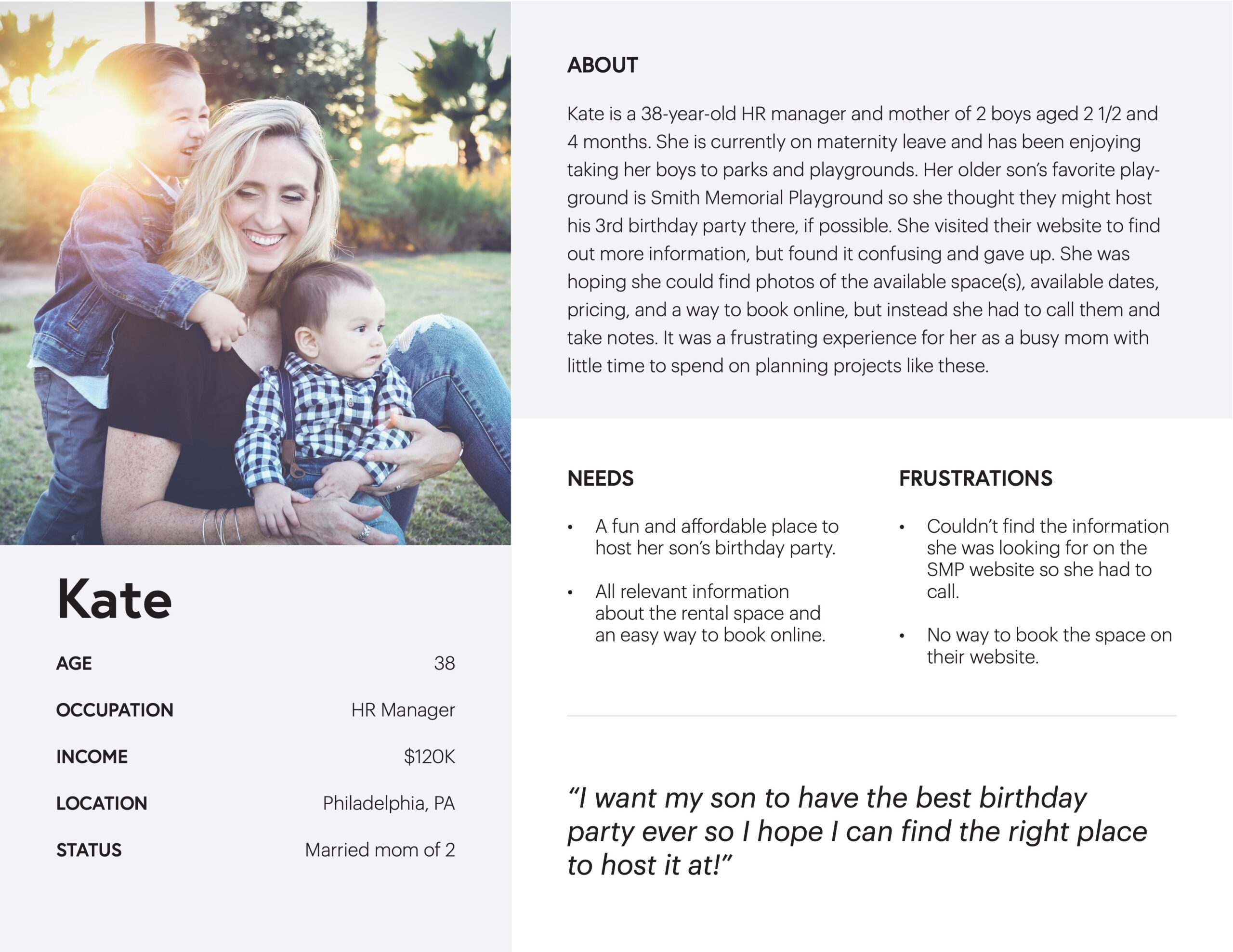
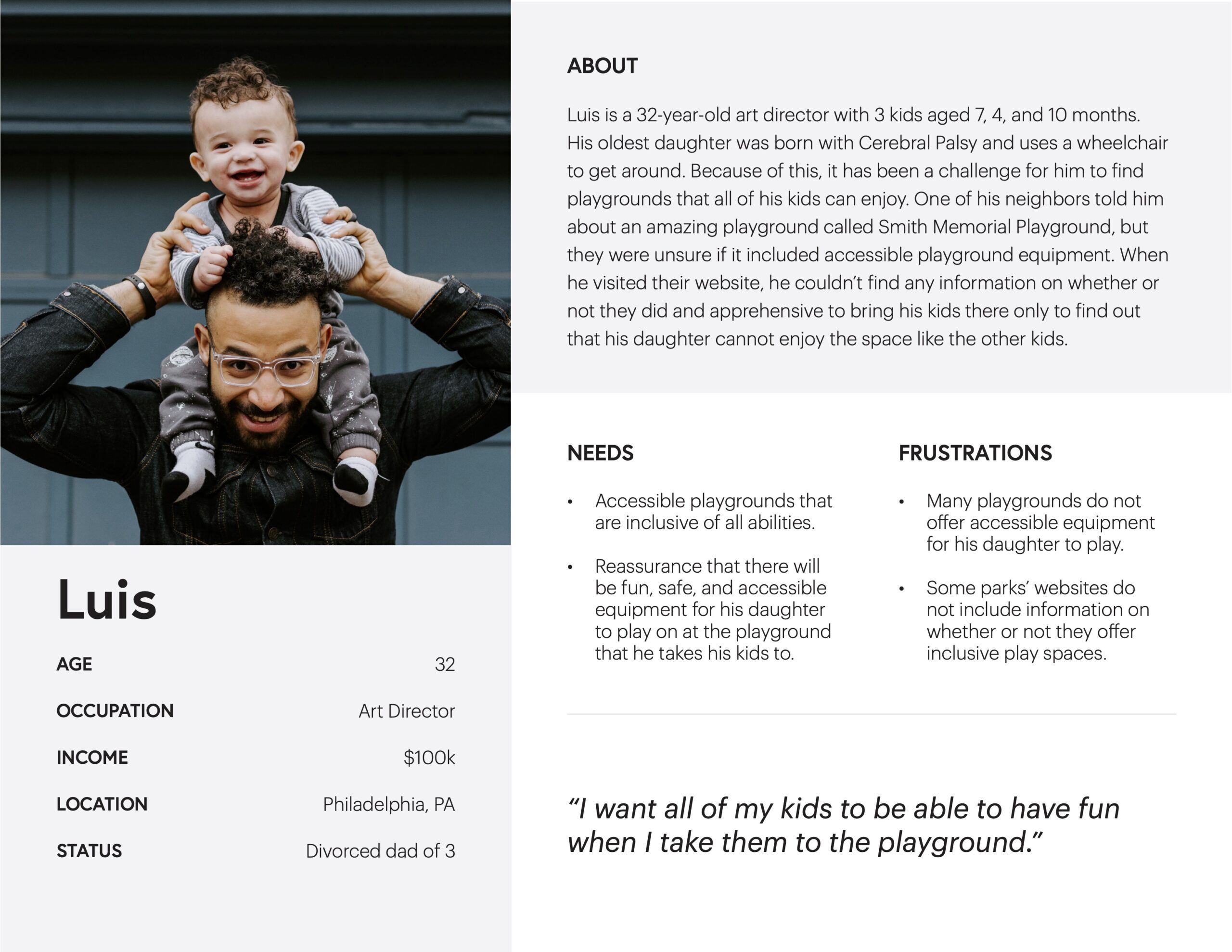
EMPATHIZE
User Personas
After completing user interviews, I took my findings to develop two user personas. These personas helped to guide me in my decision-making process as I developed the new website and helped to ensure that I was addressing the needs of Smith's core target audience.
DEFINE
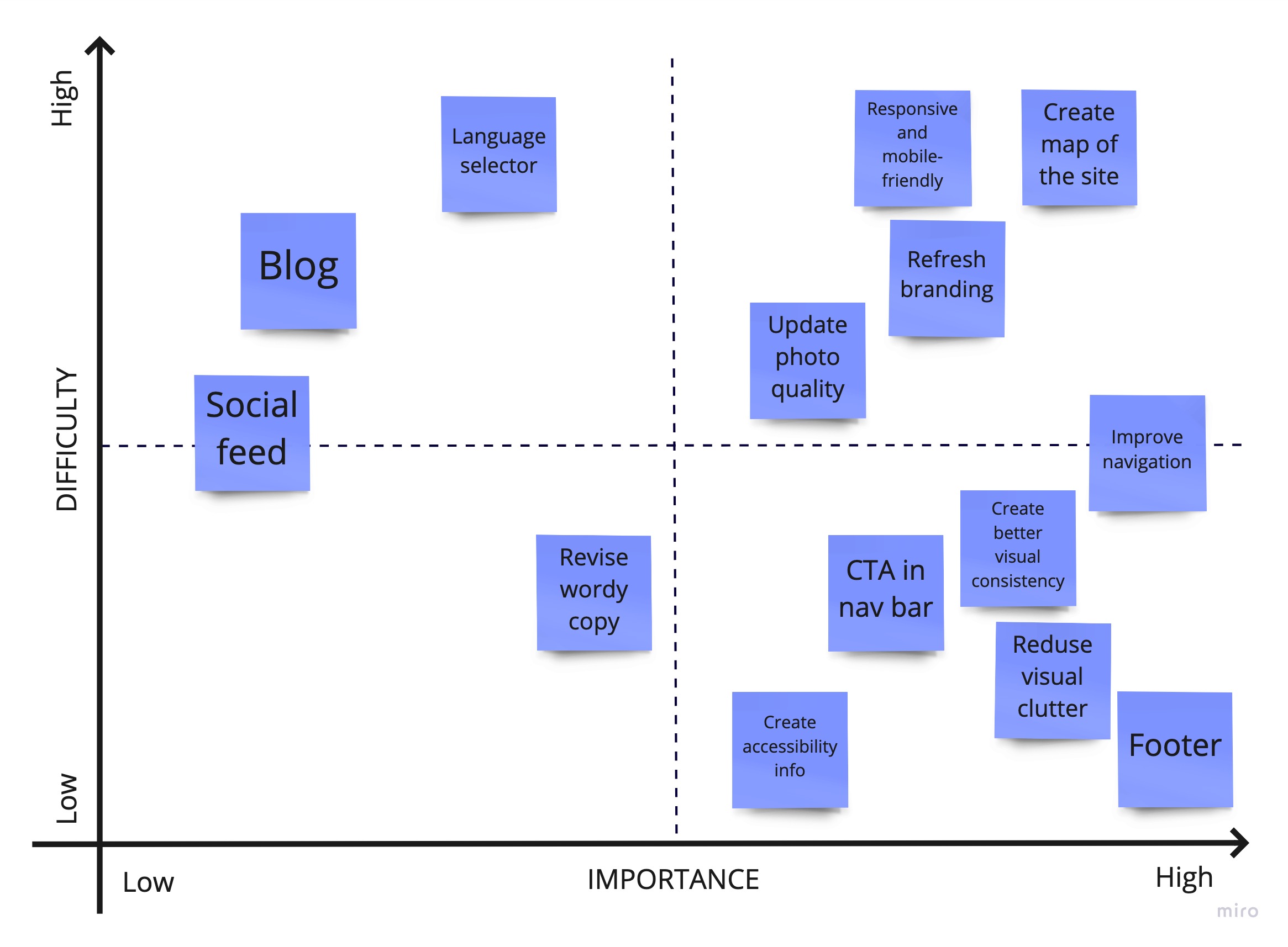
Feature Prioritization
With a solid understanding of where Smith's website could be improved, I then needed to determine which features to prioritize. I did this by plotting the options in a Prioritization Matrix ranked by “Importance for the User” and “Difficulty to Deliver”.
From the results of this exercise, I knew to first prioritize the ideas that would be quick wins (high importance/low difficulty), followed by higher impact features (high importance/higher difficulty).
DEFINE
Information Architecture
After evaluating Smith's existing information architecture and navigation, I determined that some pages were redundant and could be combined with other pages to greatly simplify and streamline the navigation, making it faster and easier for users to find the information they were looking for.
I also decided to create a footer for the website (mostly missing from the original site) which would include important information like location, phone number, email address, and hours of operation so this information would be readily available to users no matter what page they were on.
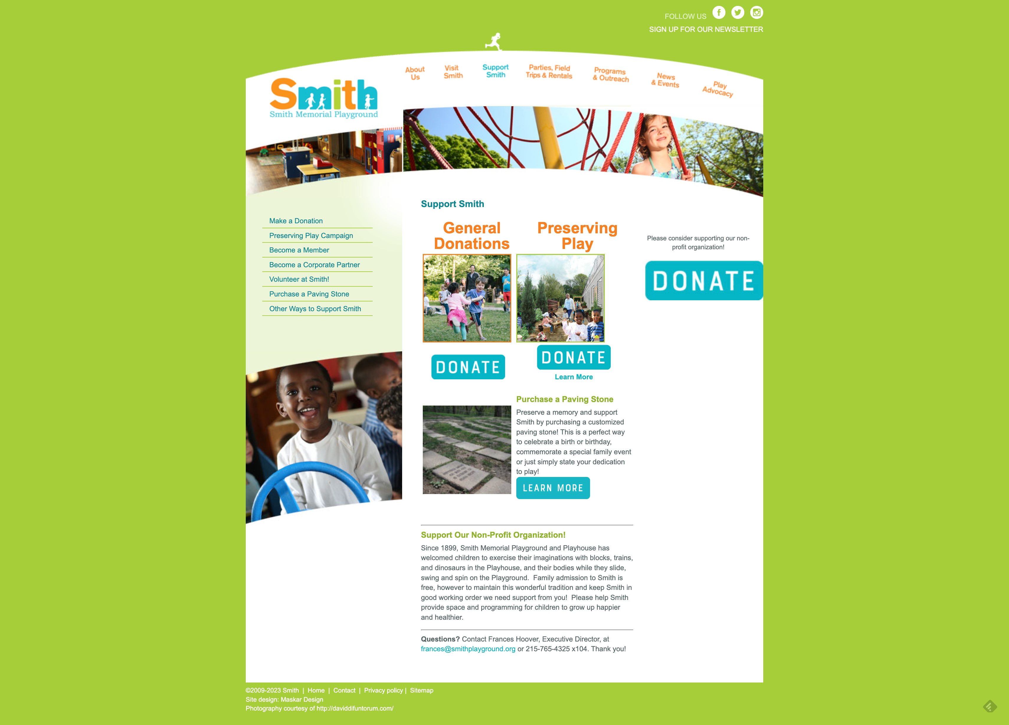
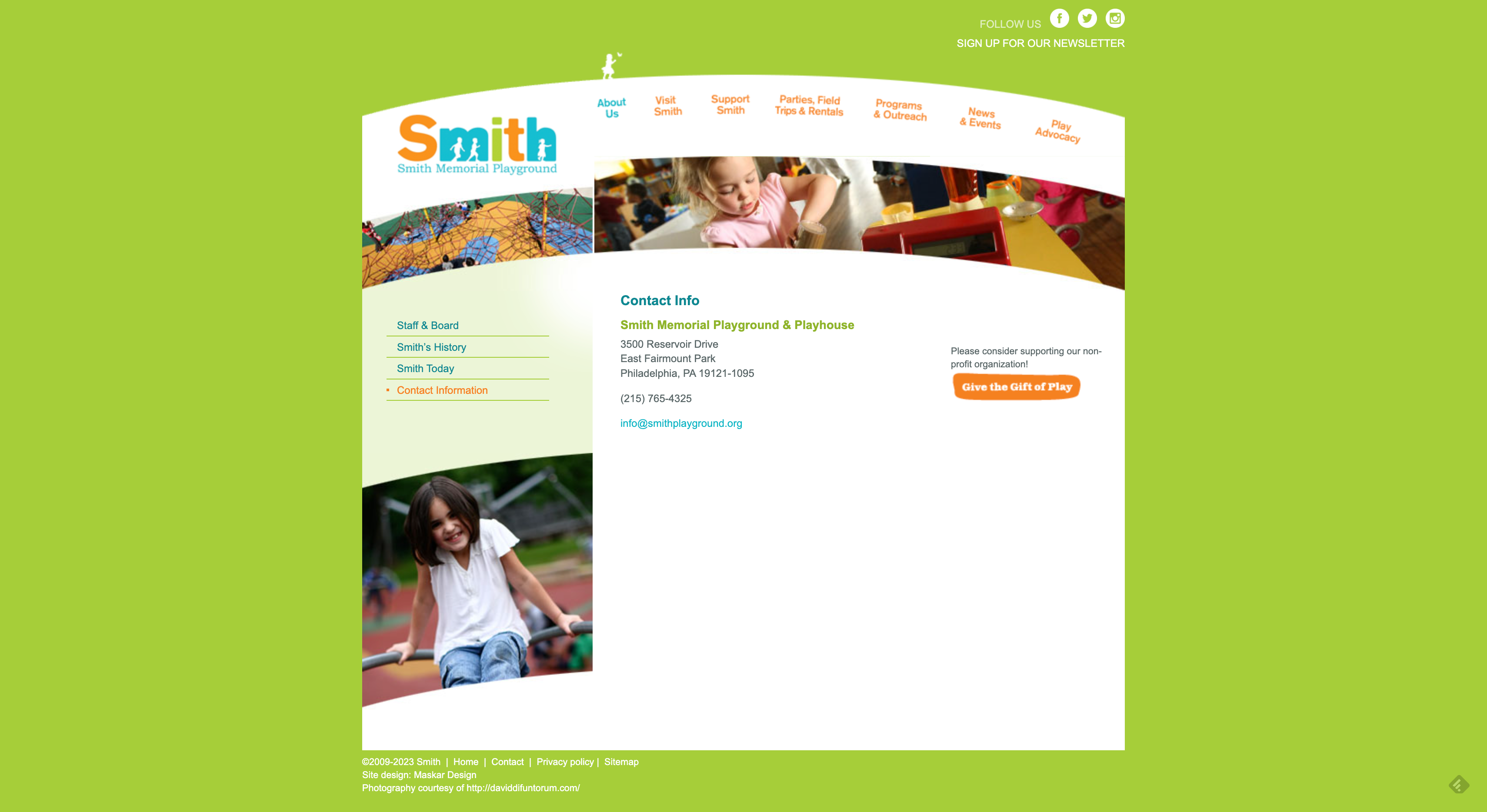
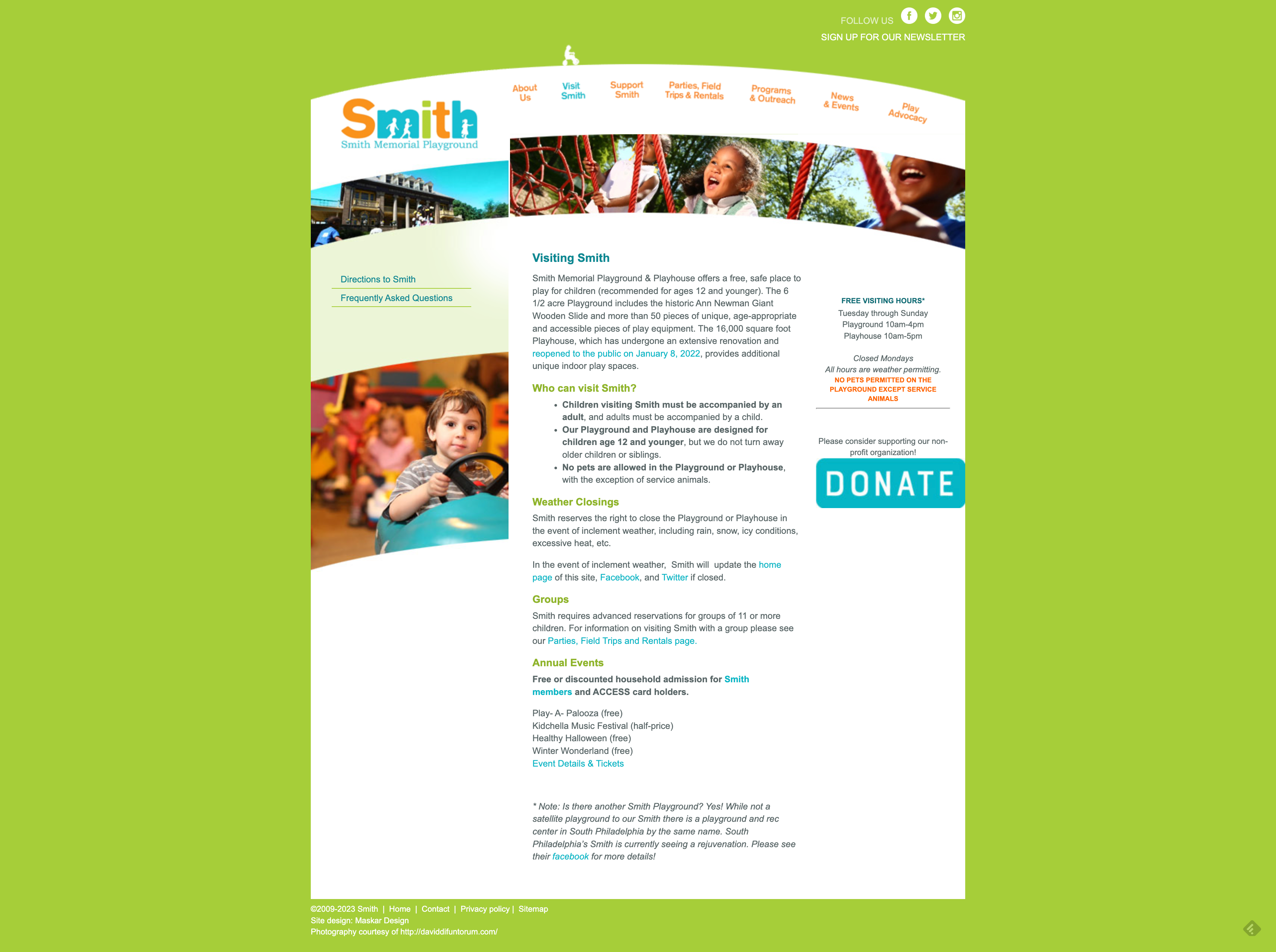
Original Navigation
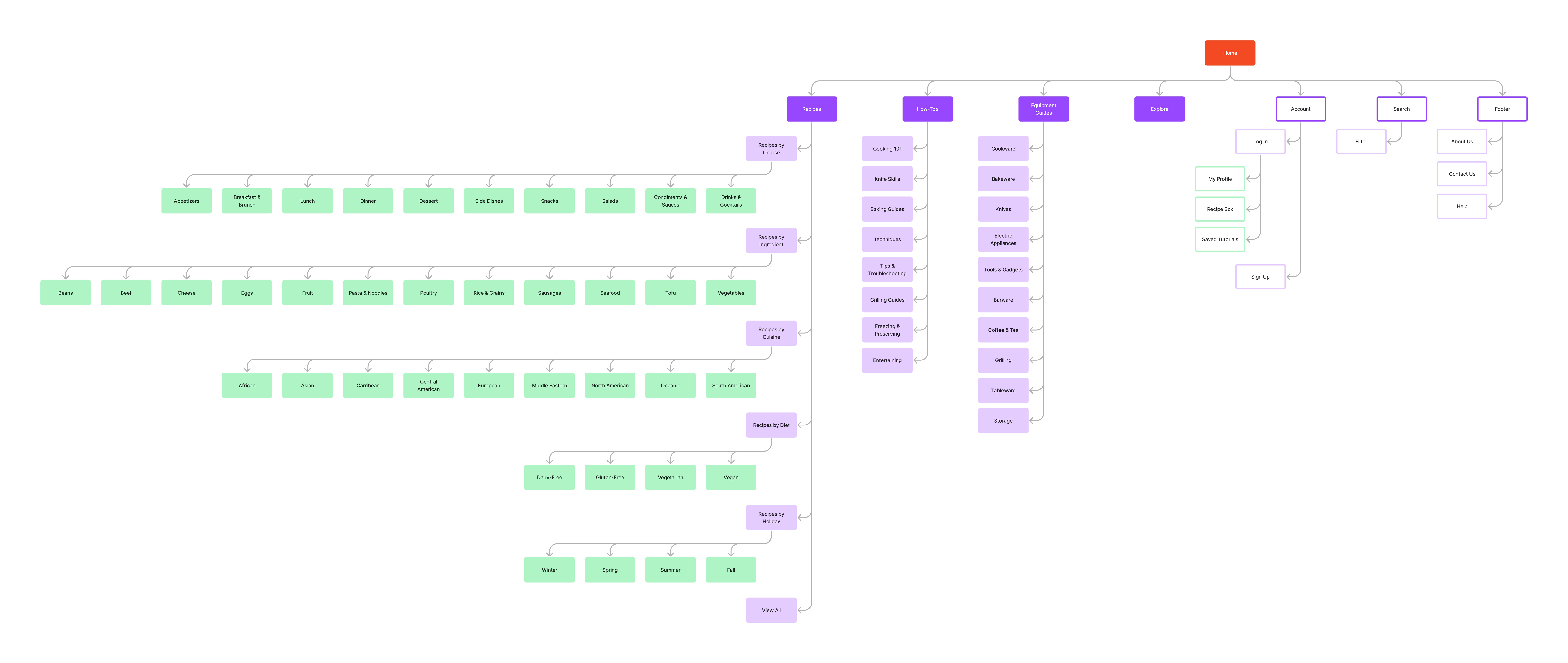
Proposed Navigation
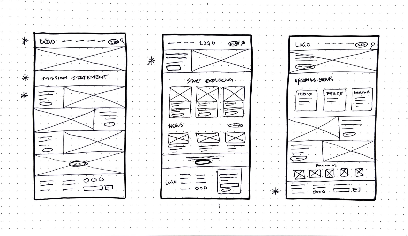
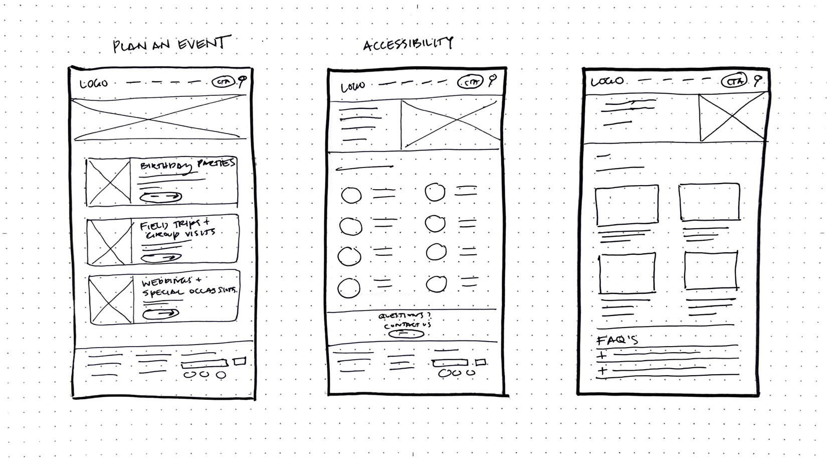
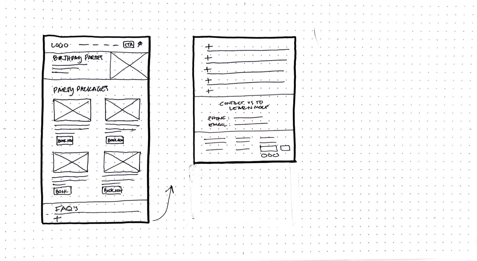
IDEATE
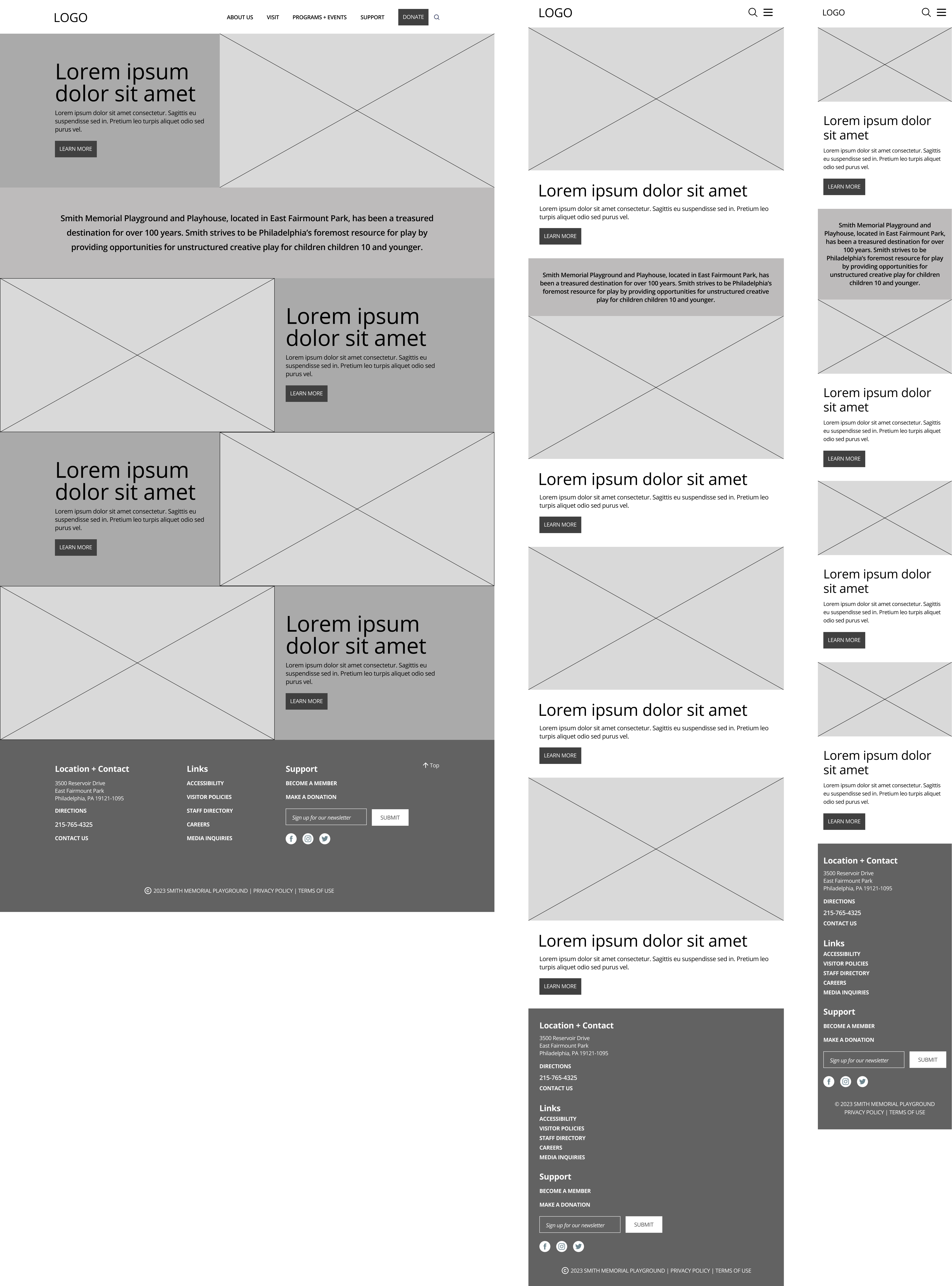
Wireframes
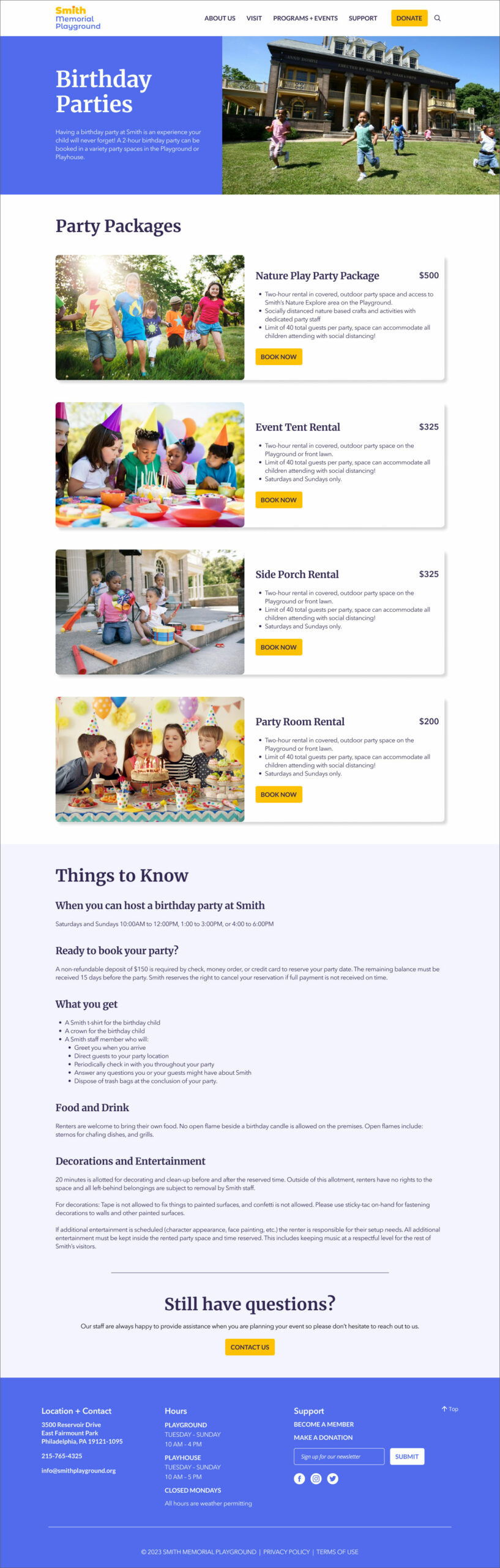
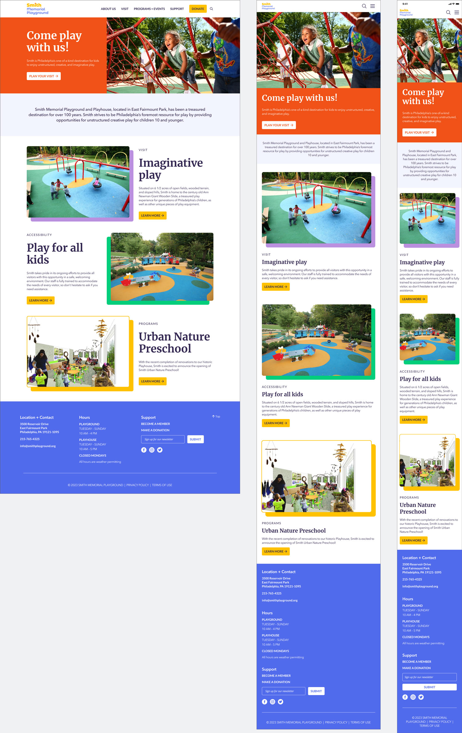
With my research top of mind, I began by sketching some of the website's key screens, focusing on two user flows – finding information on Smith's accessible play equipment and booking a child's birthday party. Since users access Smith's website from a variety of devices, I made sure to develop additional screen sizes so the site would be fully responsive.
After completing the sketches, I marked areas of the designs that I thought would work well and combined these into digital wireframes that I created in Figma. I tried to focus on developing a site that would be engaging, informative, and easy to use.
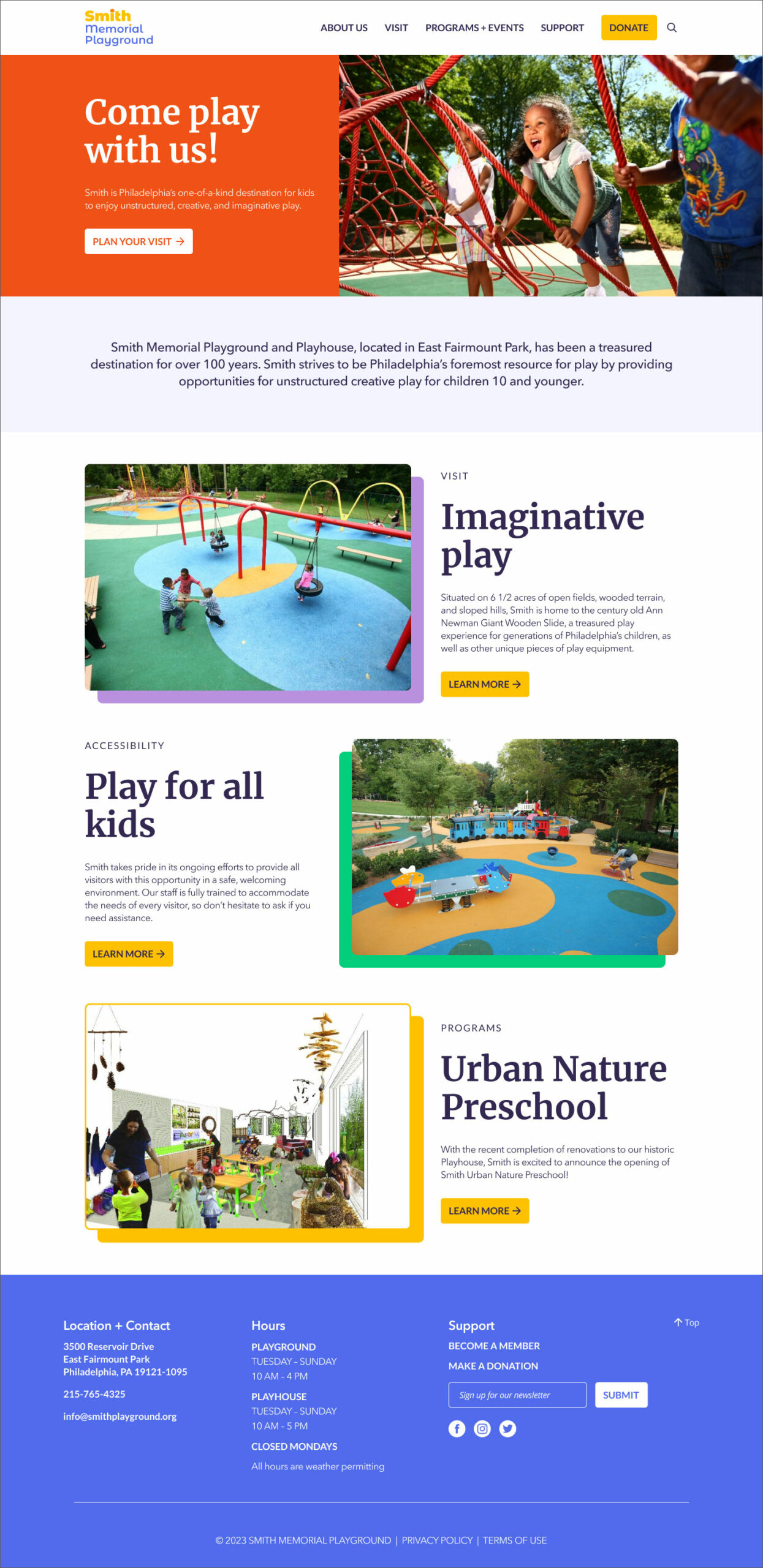
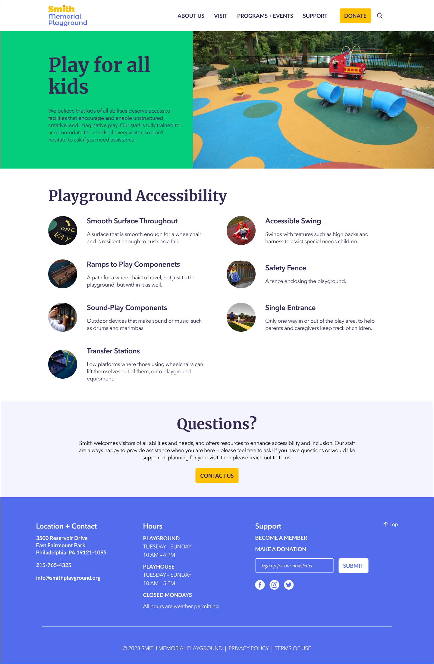
PROTOTYPE & TEST
Hi-Fi Mockups
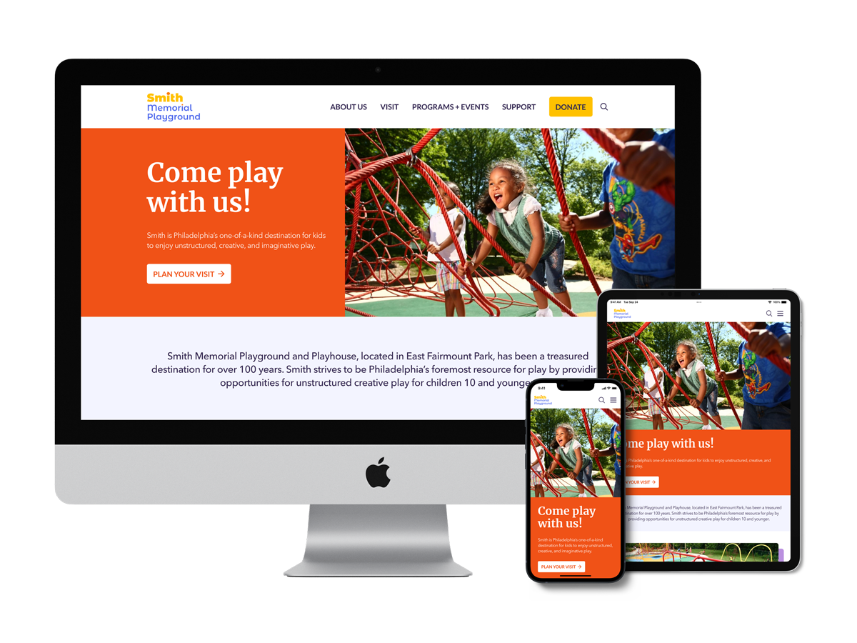
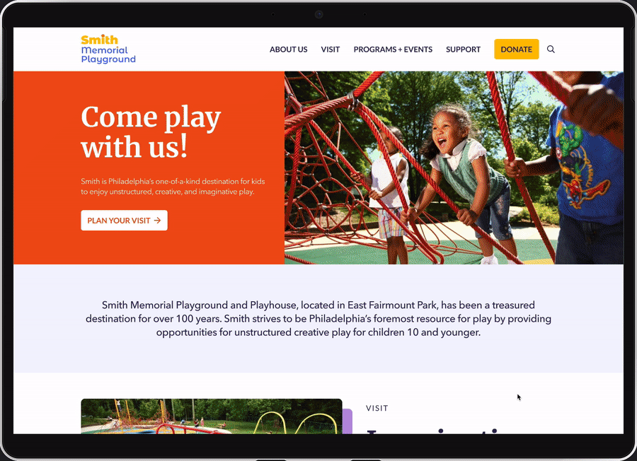
Homepage
Accessibility
Plan an Event
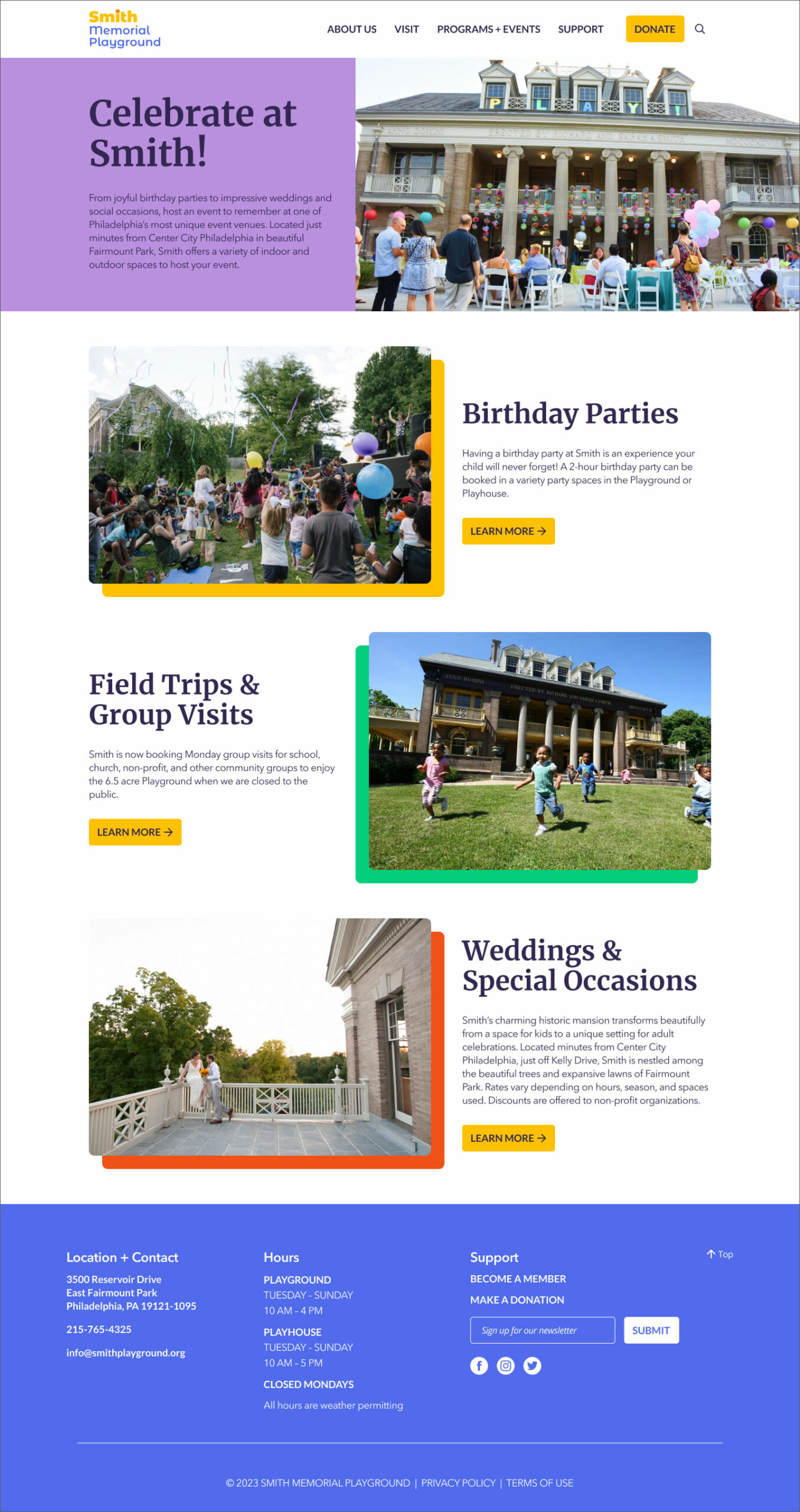
Birthday Parties
Hours & Location
PROTOTYPE
Responsive Design
Since users access Smith's website from a variety of devices, I made sure to develop screens for desktop, tablet, and mobile so the site would be fully responsive.
PROTOTYPE
Design System
PROTOTYPE
Final Prototype
CONNECT
daniellepecora@gmail.com | LinkedIn